Blackfire Continuous Profiling Dashboard
Requires Production Plan
Color-coded node dimensions
The continuous profiling dashboard employs a color-coded system to represent each dimension, ensuring consistency across different runtimes.
The intensity of a node's background color is directly proportional to the resources it consumes. As resource consumption increases, so does the vibrancy of the background color. This visual representation pinpoints application areas that may require optimization.
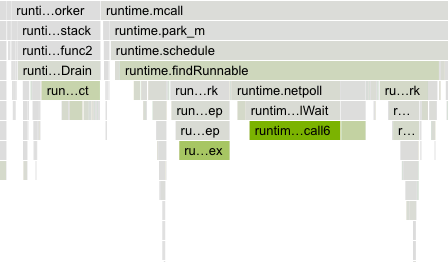
The contrast between the dimension color and the greyscale of regular nodes has been designed to ensure accessibility for all users and allow colorblind users to benefit from this feature.
Flame graph
The flame graph is a hierarchical visualization of the contribution of the different function calls to the selected dimensions.
Flame graphs are effective in identifying performance issues and understanding the behavior of software during execution.
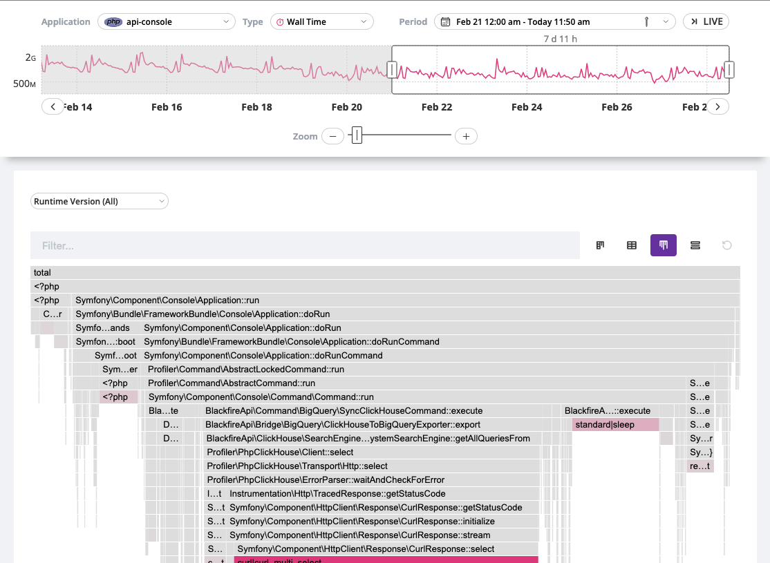
Rectangles in a flame graph are called frames. Each frame represents a function, arranged vertically (y-axis) to show the sequence of method calls.
The width of a frame relates to its resource usage. It helps pinpoint the most resource-intensive function calls.
Horizontally (x-axis), methods are sorted by name, not the order in which they run.
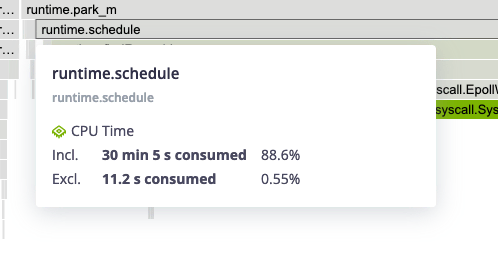
Hovering a frame displays in-depth information on it.
Double-clicking on a frame narrows down the flame graph to the callers and callee nodes of that frame.
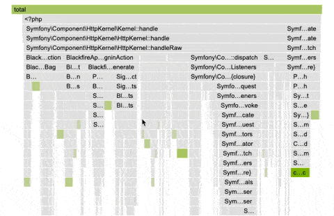
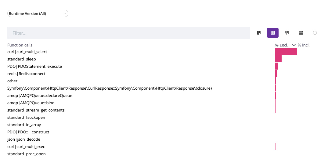
Table view
The table view displays a list of all the frames sorted by their resource
consumption, for the selected dimension and timeframe. By default, the table is
sorted by exclusive resource consumption, which is the total value of the frame,
minus the combined total values of its direct children.